Hop Raider
Over a period of 2 months the game Hop Raider was conceived, planned and published in the Android, iOS and macOS stores. Throughout the process I was in charge of product, visual and level design as the Lead Product Designer.
Research
Scope and goals
Since the proposal was ambitious and ambiguous, we decided to build a research plan in order to understand our challenge and realistically narrow down our goals, so we separated the research into the following questions.
What is our target audience?
What are the mobile gaming habits of our potential users?
Which similar games have managed to work and how?
What makes a mobile game good?
Methodology
To advance our proposition, we conducted four different research methods: market and competitor research, interviews with regular mobile game users, interviews with industry specialists, and surveys of potential users within the target demographic.
Insights
People who play mobile games are a diverse demographic, but the profile we would like to work with tends to be young people who don't mind paying little money for software but don't like ads and microtransactions.
People don't want to have to pay to progress in the game.
People stop playing when they have played through the game or when they notice that it becomes repetitive.
Not all mobiles are high end; many have problems processing heavy graphics like 3D.
Ideation
From all the product research, we concluded that a game that can be played with one hand is ideal. Also, a frenetic game that invites you to overcome is interesting.
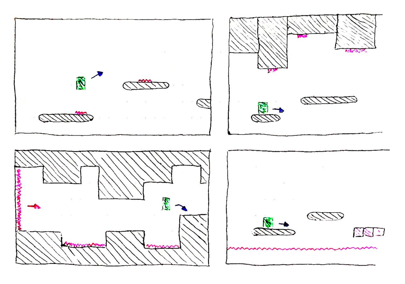
We started working on the idea of a 2D platformer reminiscent of the classic Game Boy Mario games.
We studied different possibilities, such as having levels, worlds, playing vertically, horizontally...
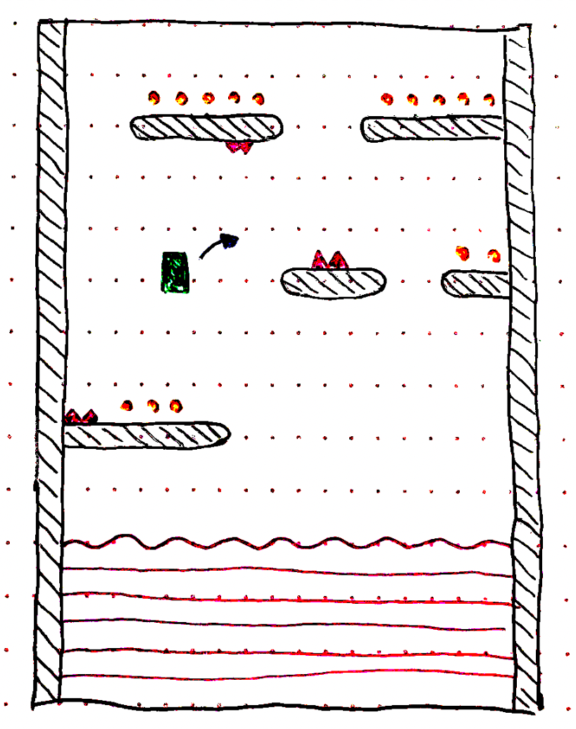
We finally settled on a combination of Mario and Flappy Bird, i.e., a platform game that is reminiscent of Mario, that can be played with just one finger and that is infinitely generated until the player dies in the game.
Gathering feedback
Prototype
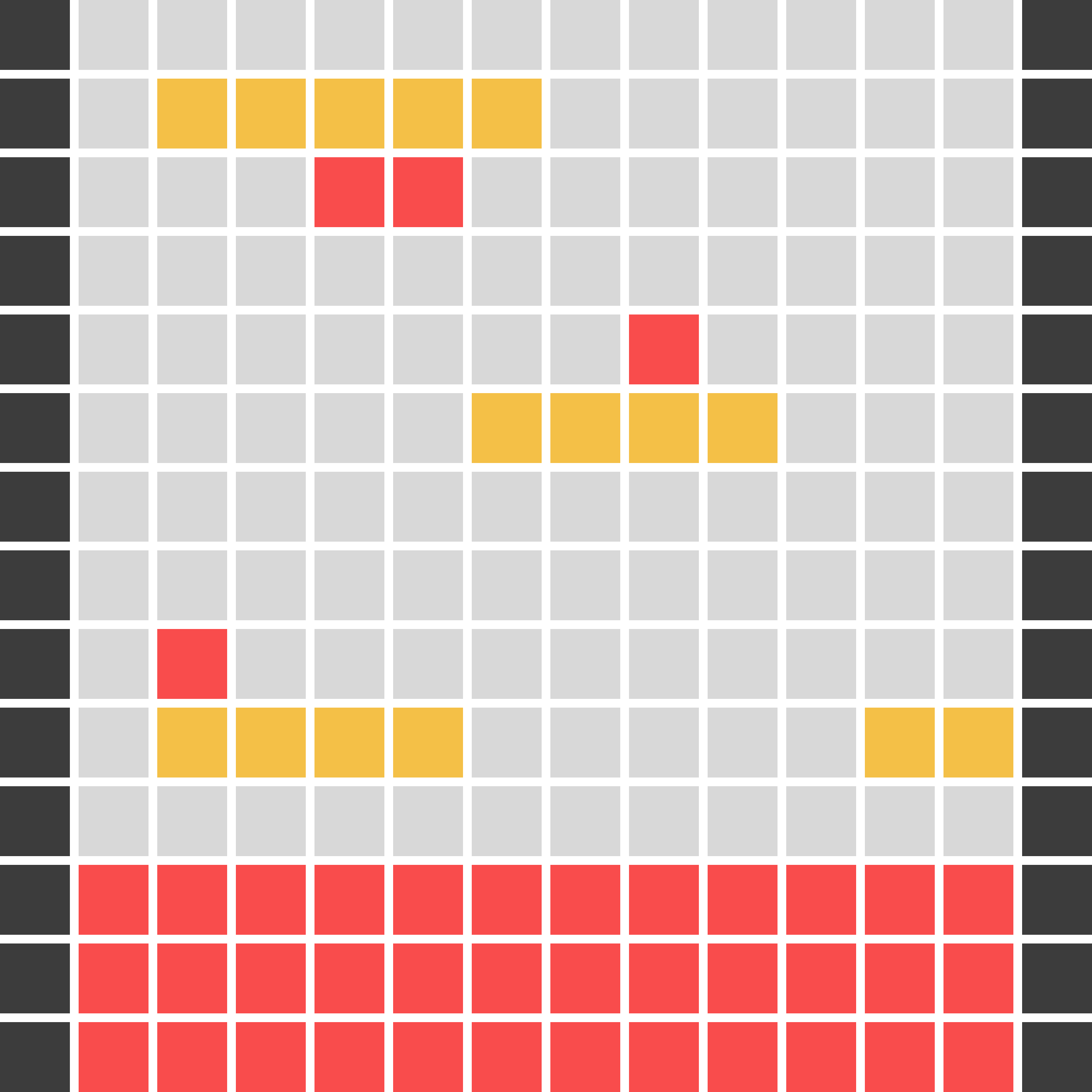
We built several prototypes and several mockups. With the prototypes, the intention was to evaluate the gameplay and the mechanical possibilities of the videogame, discarding at that stage the visual aspect.
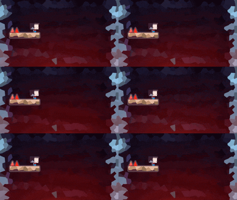
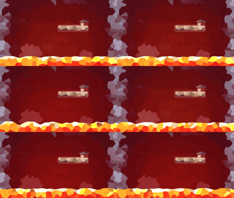
With the mock ups, the intention was to find the art style that best suited the value proposition of the game and the expectations of potential players.
Testing
The prototype testing was carried out in two phases; an initial one, to evaluate general design aspects from the first proposals (like the images above), and a final one, in which a working prototype with the basic gameplay, i.e. infinite level generation and click-to-jump mechanics, was evaluated. The results were as follows.
Industry professionals agreed on the need to eliminate friction between games, that being able to play once you had lost should be almost automatic, so we came up with a big button to continue playing once you had been eliminated.
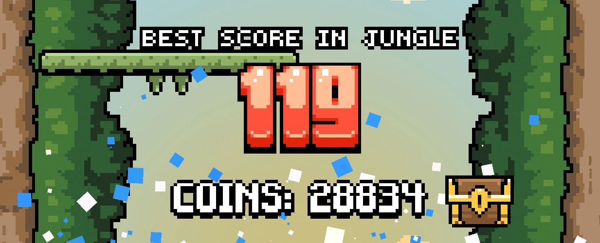
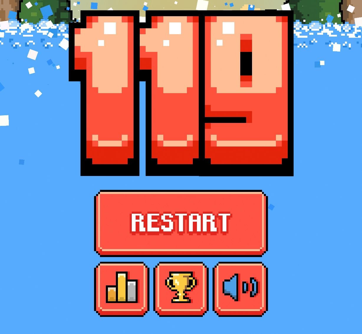
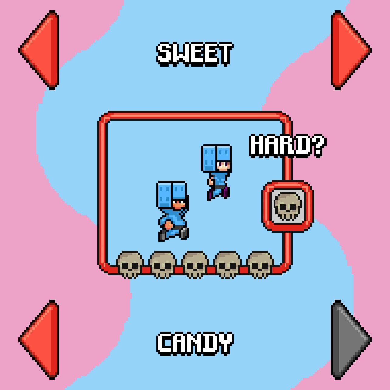
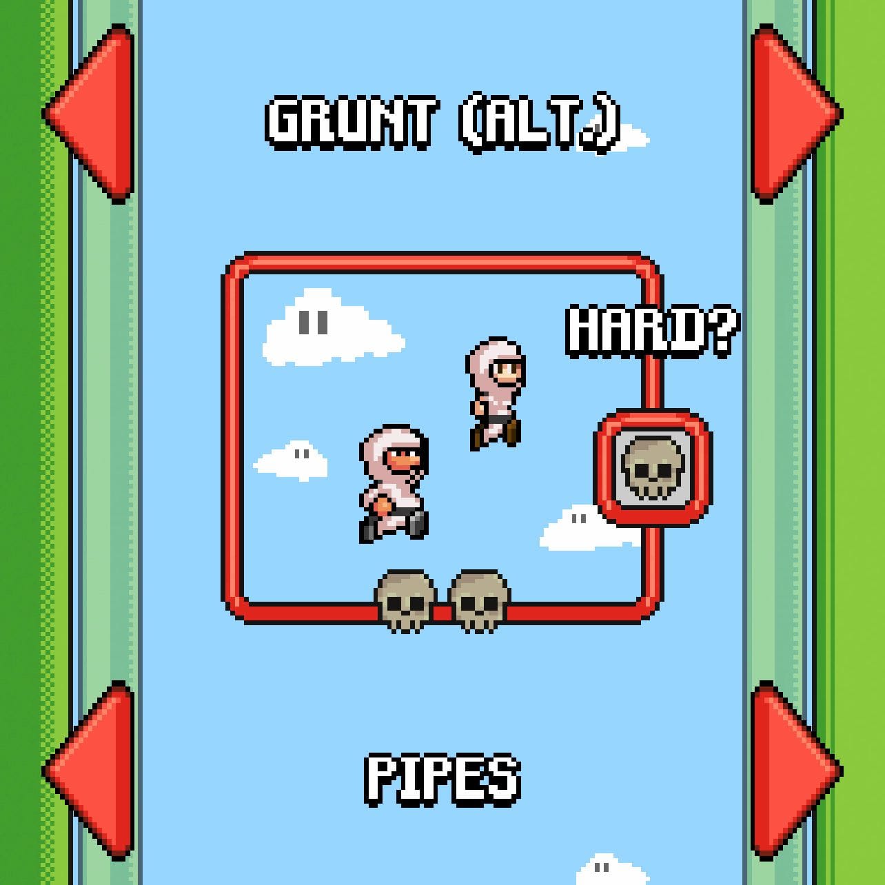
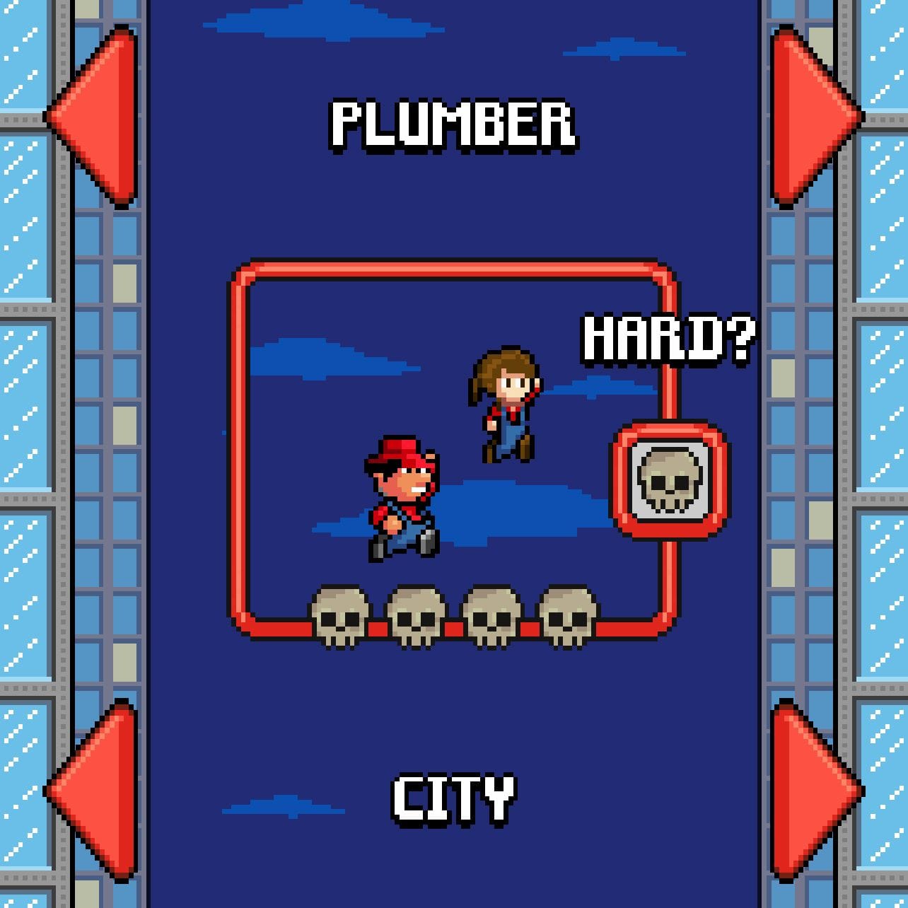
Players were generally very satisfied with the prototype but lacked motivation to keep playing after a few sessions, so we defined the inclusion of unlockable skins and the inclusion of different levels with different play styles.
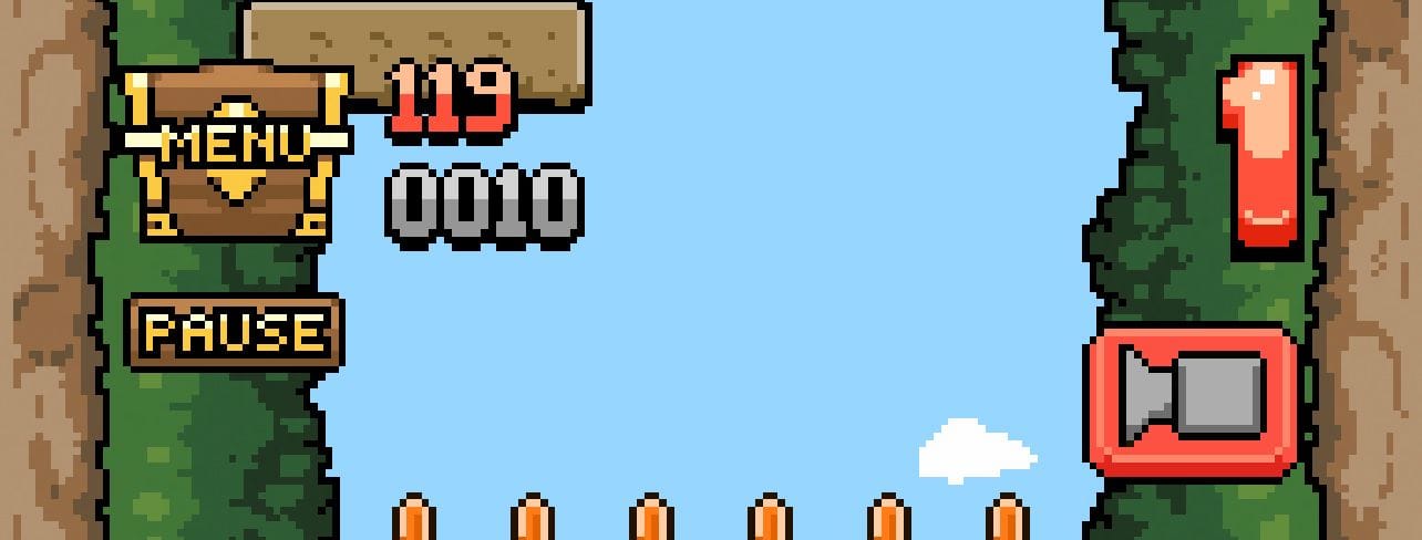
The tech profiles proposed to add extra options that could be useful, such as the option to record games directly from the game or to compare records with friends, so we implemented it in the final version.
Results
Final solution
The final result is an infinite runner game, meaning that each game is potentially infinite, with procedural generation (each game will be unique, always) consisting of jumping between platforms to avoid being caught by lava or water and avoiding spikes and obstacles, collecting coins along the way which, together with set milestones, allow the player to unlock new content.
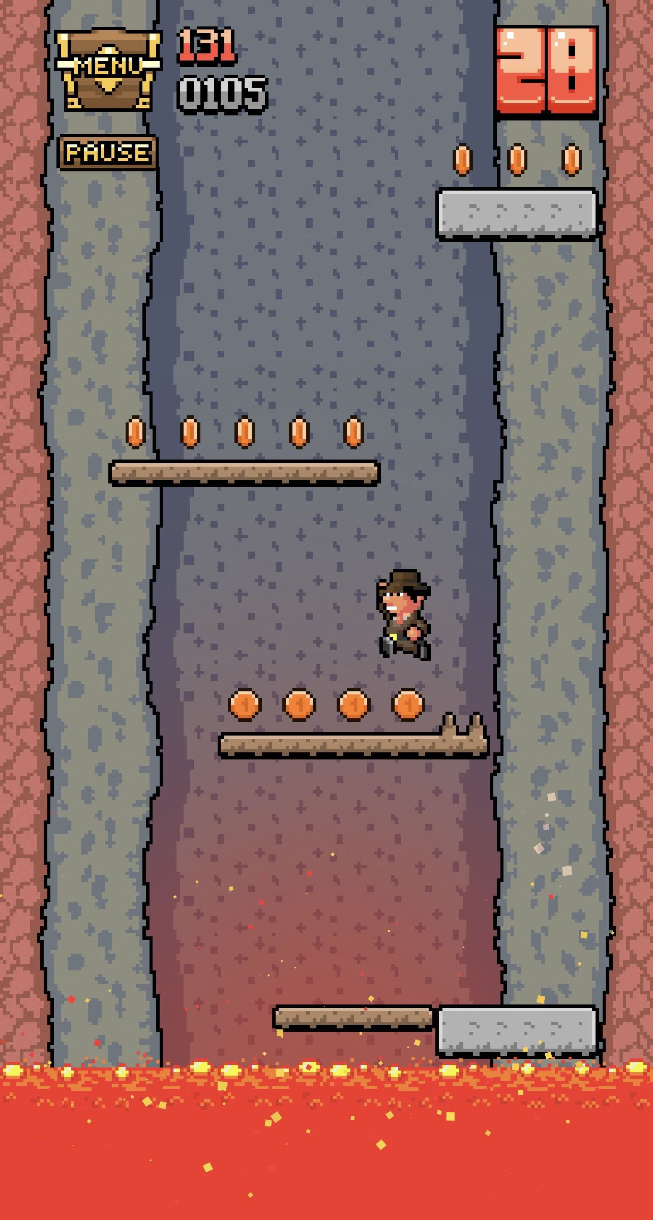
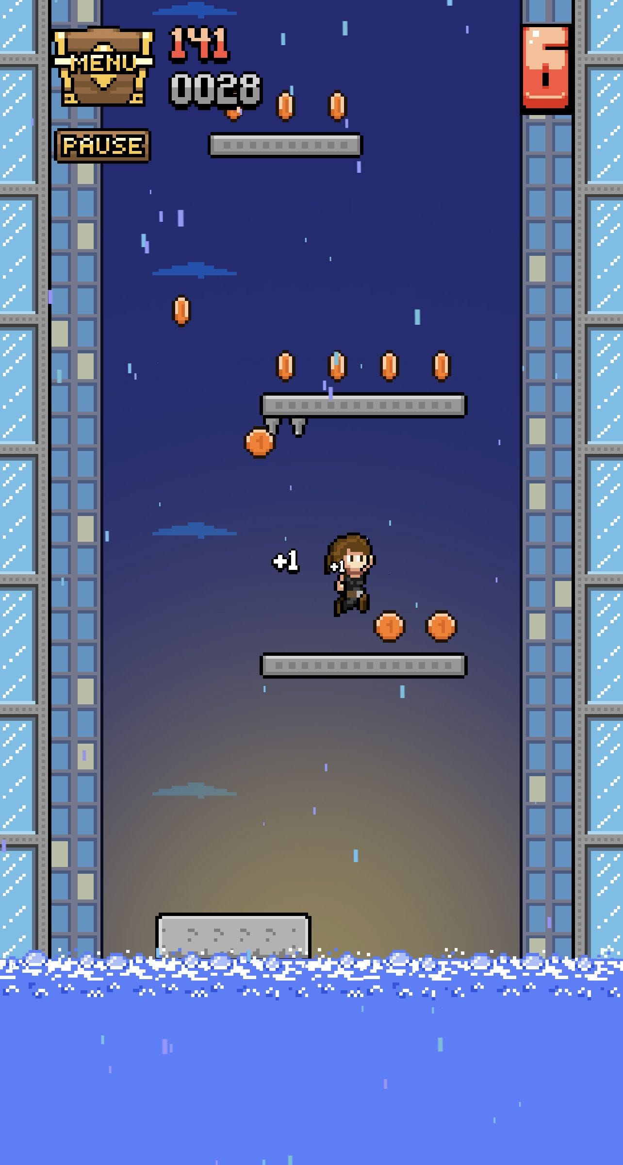
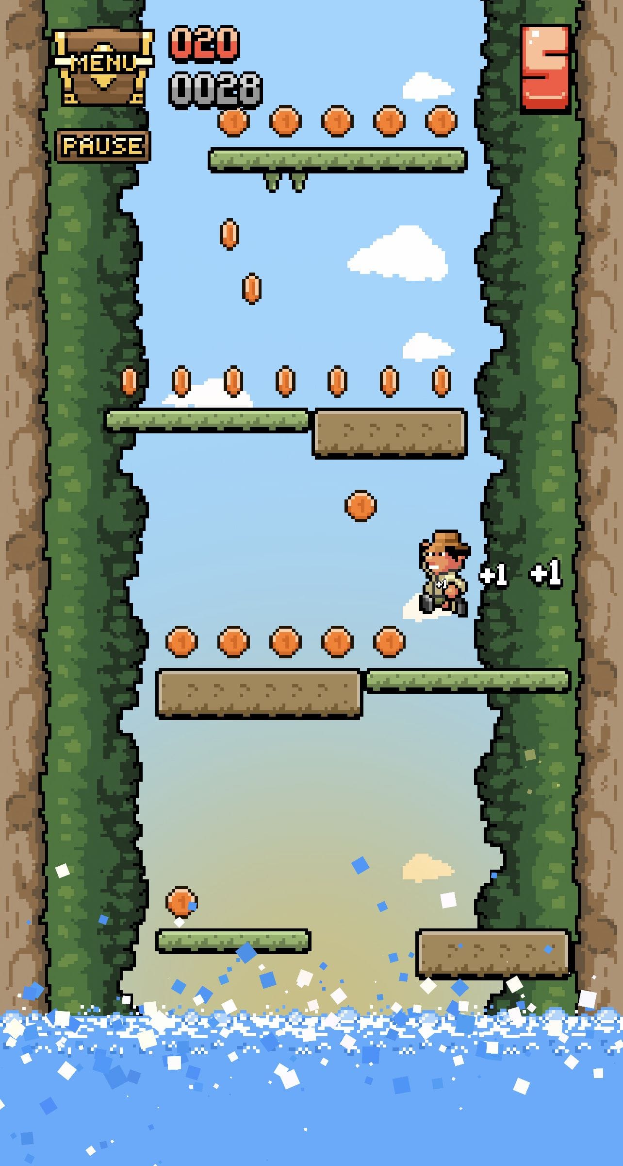
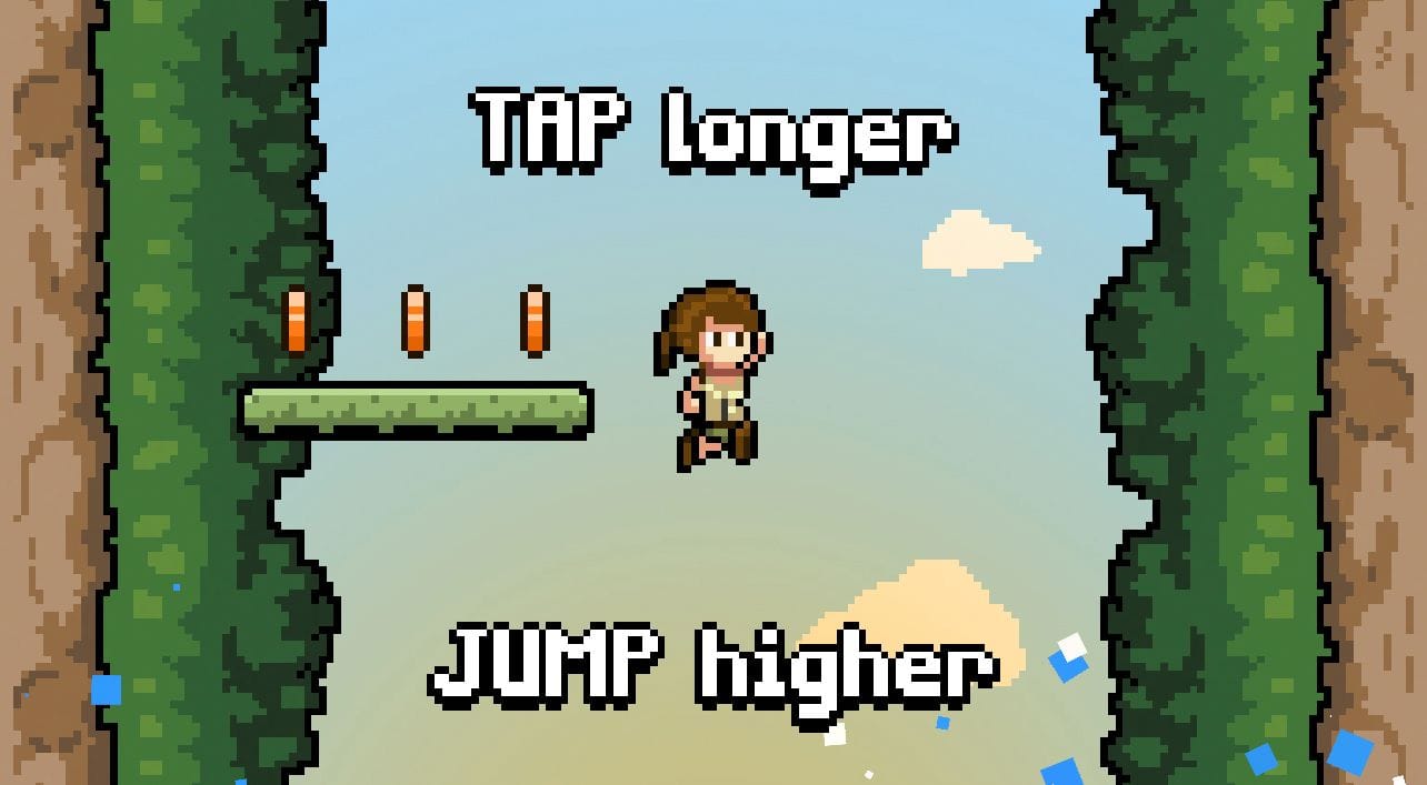
The gameplay is extremely simple: the character walks automatically until he hits a wall or reaches the end of the platform he is on; to jump, the player must press anywhere on the screen to make the character jump, more or less wide depending on the duration of the press. This makes for a challenging but accessible mechanic.
During the game, the player earns coins of varying value which, at the end of the game, are added to the coin purse. The money earned can be used to buy new maps, each with a different and more difficult gameplay style than the previous one.


As each "floor" is climbed, the player unlocks a level point which is used to indicate the highscore, which can be used to beat oneself, play against friends or unlock extra content.


All maps can be played on two difficulties: normal and hard. The second mode adds rock platforms that cannot be traversed to standard platforms, adding a particularly tough challenge for those who want more.
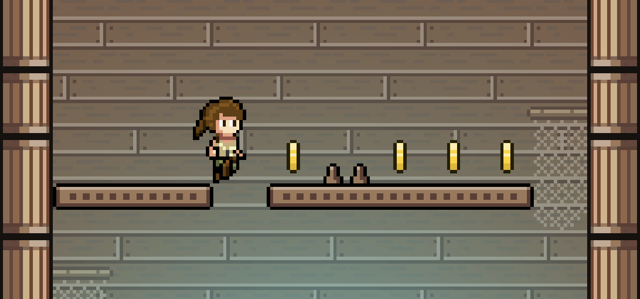
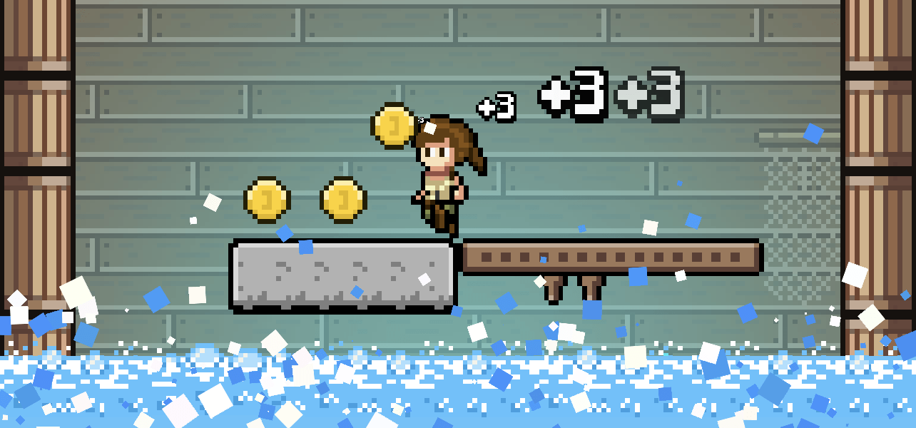
Reaching certain points in each of the available stages will reward the player with an exclusive playable skin, which invites you to get to know the ins and outs of each map.

Result
The final product was extremely well received in all the communities where it was shared, including the largest Spanish-speaking forum in terms of number of active users, Forocoches, or the Product Hunt aggregator, where Hop Raider even won the game of the week ranking.

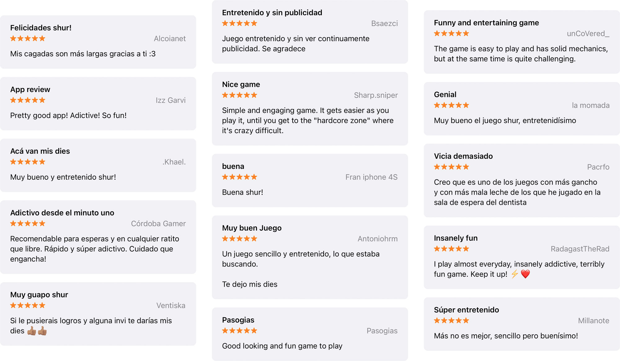
Moreover, since its launch, it has maintained a five-star average on the AppStore with a steady stream of positive reviews.
Plans for the future
The project is ambitious and it works; we would like to use all the feedback accumulated over the years to create an even more solid and fun game, with levels, new mechanics, new enemies... But this is still to come!
